new gmail compose design is equivalent of suddenly substituting car’s steering wheel with a joystick.
and after you actually paid for a car with a steering wheel.
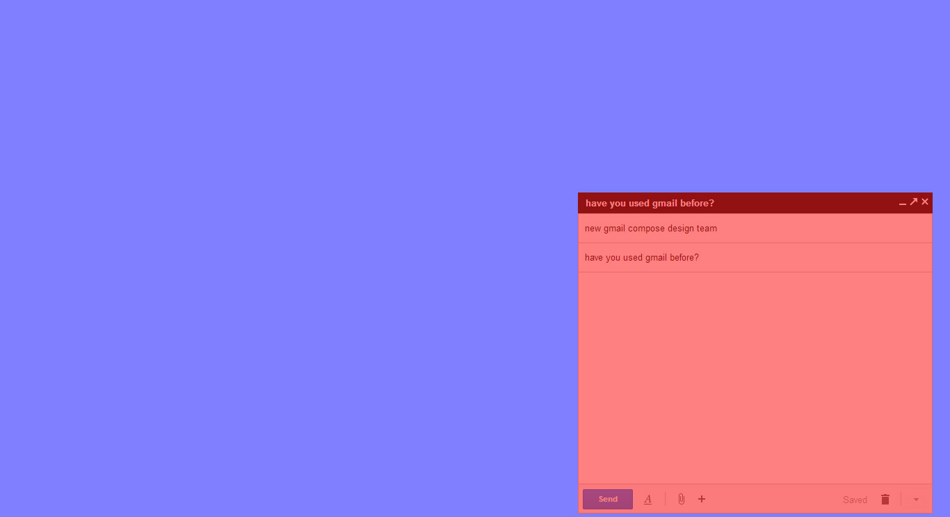
position and size of compose
i mostly use big wide screens.
i work 10+ hours per day.
i write a lot of emails, and i take my time in writing them.
emails i write, just like this blog post, require focus.
new gmail compose is now reduced to a very small bottom right part of my screens.
i will be forced to look in a direction a bit right from my right shoulder tilting my head by some 15 degrees.
also the space for text is substantially reduced thus forcing me to scroll more.
what is the point of getting bigger and bigger screens when someone makes your software smaller?
i expect a neck injury and eye damage in few months if i continue using new gmail compose.
what is multitasking?
google argument is that new gmail compose is designed for multitasking.
i do not multitask when i write emails.
what does multitasking mean actually?
i can either write an email or do something else.
google decided an email is not a document, but a chat
i never was excited about the gmail conversation metaphor.
email is a document.
i write it and send it.
someone replies.
i used faxes before, and i see absolutely no difference between early 1990s fax and gmail today.
fact that same subject emails are sorted in a conversation is nothing new.
i have done this with faxes and paper folders in 1993.
however, google got carried away with the metaphor of conversation and turned the email into a chat.
the new gmail compose is a copy of facebook chat.
problem is – facebook is a social network where you really just want to chit chat with others.
gmail is a professional tool used by businesses.
chat is not a place to discuss business.
not only it needs more scrolling, but it needs more clicks
i need to click to add cc, which drastically increases my keyboard-mouse switching.
i also need two clicks to reach labels.
why force people to use the new gmail compose?
finally, none of above would be a problem if i was given a choice between old and new compose.
it makes no sense to simply order paying customers to use only the new compose.
why not give a choice?
conclusion
an immature business and design decision by google.
i would like to know which genius came up with this design fail.
google design pattern
google’s pattern is to start with engineering quality and as quickly as possible switch to appealing to masses.
gmail is latest example how design quality is compromised in order to appeal.
this is simply paranoia from google, who seem to believe that one can not go with the other.
facebook was always much more able to combine quality with appeal.
like, comments, and image tagging features are intelligent, high quality, and have great appeal.
google keeps making decisions to cut on quality in order to get appeal.
we see that in search, and now google apps.
google business style
google is overrated as a global player.
google is a local player confused with handling big global design decisions.
simply, google is nouveau riche or better said vulgar.
their design has more and more been about ordering instead of pleasing, covered by a lot of aggressive pr.
luckily, google glass video is able to take the attention from their failure to designing simple html forms.